Here I am now in March 2021, and I think I’m finally at the point where I can talk about landing pages without having a crisis. It may have taken me a while to get my head around (and it still confuses me sometimes now) but I’ve discovered some key features of a landing page on my journey to becoming a competent copywriter, which I’m going to share with you here.
How to get to a landing page vs. a homepage
I’ll have to explain this the only way I know how (through a very elaborate metaphor).
Imagine you’re flying around on a spaceship through the internet. You’re in need of a new spaceship because yours is getting a little rusty, so you take a look around. You see an advertisement for a range of brand new spaceships available with 15% off your first order. You go to take a look. You’re literally ‘landing’ on a landing page.
Now imagine you’re flying around again in search of a new spaceship. You see a link to a company that sells spaceships and a variety of other products. When you land on the site, you see that there is a ton of information about the company, the team involved and the products they sell (including the brand new spaceships). You’ve landed on a company’s homepage.
Don’t overload the page with text
Basically, you want to get to the point. If you’re advertising your online classes, you don’t need to spend a paragraph telling the customer where you were born and how you believe being a Pisces has affected your upbringing. You want to show the customer why they should follow through their enquiry by showing how your service will benefit them (preferably in as few words as possible).
Include a catchy and relevant header
A powerful header is important for both a landing page and a homepage. With a landing page, it is also important that your header links to the advertisement the customer has clicked on. You don’t want them clicking on an advert about spaceships and then the header is talking about their lawn mower range. You want to be able to click on something and be brought straight to the information that correlates, to increase your likelihood of a sale. They’ve clicked on your page for a reason, you don’t want to waste this prime opportunity.
Testimonials
Having the voice of previous customers is important to include. It shows that your company is credible because other people have bought your product and liked it. If you’re browsing a site with the possibility you might buy something, you are most likely to believe an opinion of someone like you, rather than someone who you might think is just being paid to be positive. I know if I’m looking to buy from somewhere that I’ve never bought before, I’ll immediately read the reviews. And if I notice that a website doesn’t have reviews showcased, I usually assume that the product is going to explode in my hands, the hotel room is going to be full of mosquitoes or the biscuits are going to poison me (these are slight exaggerations, but I really mean it when I say only slight).

Key benefits of the product/service
Imagine you’re giving a pitch about your product to a room of hundreds of people, what are the key things you’d mention? Why do you stand out compared to your competitors? I have found it is important to home in on why the customer is in need of your product too. You want to show how your product can eliminate their problems and ultimately make their lives easier. Sometimes, they might not even realise the extent of their problems until you’re addressing them directly. Recently, I bought a device that helps clean out pet hair from your carpet. My house is 90% wooden floor, but the way they advertised it made me suddenly really hate my probably secret-hair filled carpet. I haven’t looked back.
Keep the links and CTAs to a minimum
If they’ve clicked onto a page with four CTAs, it might leave them a little confused. There would be ‘too many cooks’, when all you really need is one clear CTA. Having links to other sections/pages may also be too complicated. The landing page is there to solely create conversions. If they don’t want to convert after they’ve read your landing page, then they don’t want to convert. Having another five pages to try and persuade them is only going to annoy them.
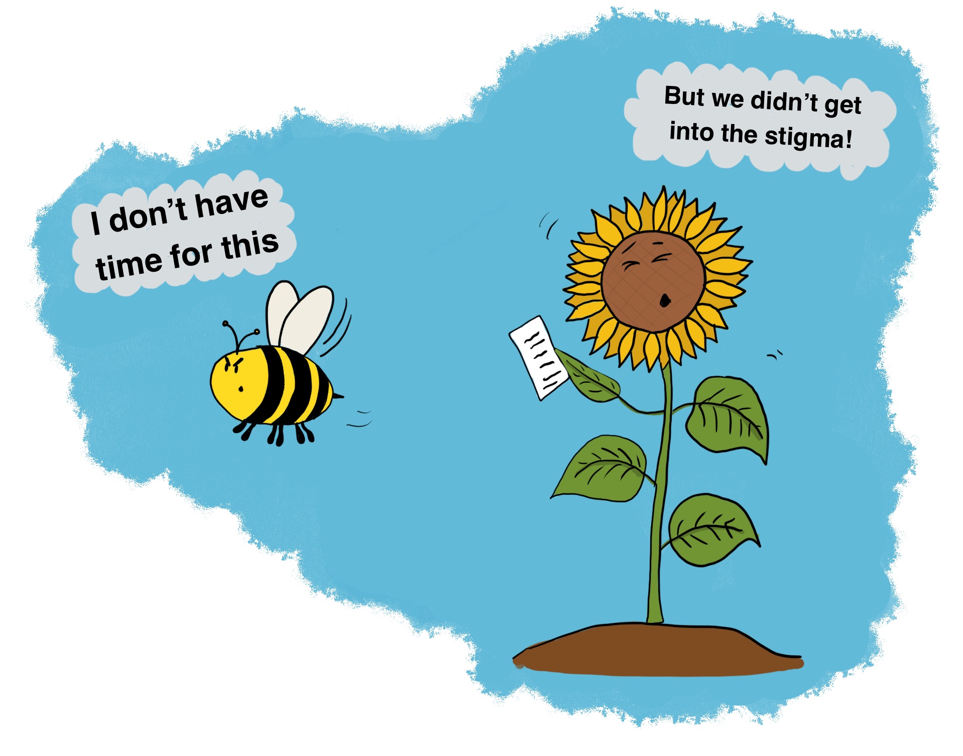
Another metaphor coming up: they are bees and you are a flower. If they want your flower, they will look at your benefits and go to you. If you’re prodding them and going off on a tangent by showing them your leaves and stem, they will lose interest. They came for a flower, not a science lesson.
As I mentioned in my previous post, if someone had mentioned the words ‘landing page with’ no context, I would have immediately thought it was to do with aeroplanes. They are now another thing I can add to the list of ‘things I’ve learnt about’ (even if it did take about five metaphors to get here).
Start optimising your website
Book your free 45min performance review
2/4 Slots available


