The problem
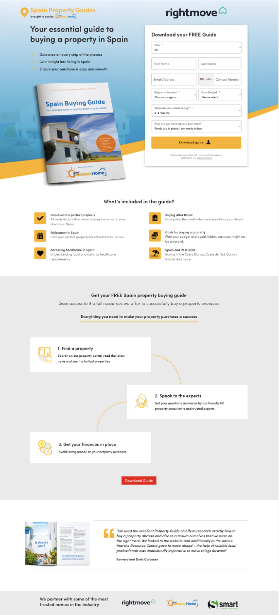
The original landing page for Smart Currency Exchange was trying to do too much with too little trust.
Despite offering a genuinely useful free guide, the page looked… unfamiliar. Rightmove—Smart’s big-name partner—was barely visible. Users had no anchor of trust. And when you’re asking someone to share their contact info, trust matters.
We were stuck at a 9.49% conversion rate. Not bad. But not good enough either.
What We Tried
We tested a simple hypothesis: if users trust Rightmove more than Smart, let’s lead with Rightmove.
So we flipped the layout. We put Rightmove’s logo up top, matched their colours, and restructured the page to feel more like something Rightmove would send you to. Smart was still there—but more as the helpful sidekick than the frontman.
This wasn’t a branding exercise. It was a trust shortcut.
The outcome
-
Conversions jumped from 9.49% to 14.04%. That’s a 48% increase. Confidence level: 97.18%.
-
User engagement skyrocketed by +311.37%. Scroll depth, form starts, and time on page all went up.
This wasn’t a minor uplift. It was a different experience entirely.
What This shows
You don’t always have to lead the charge with your logo.
If users trust your partner more than they trust you, let them go first. Borrow that familiarity. Ride their credibility wave. It might feel counterintuitive, but this test proved: recognition beats ego—especially at the top of the funnel.
Not every solution needs a redesign. Sometimes, it just needs a reality check.

The Results
Before

After

Start optimising your website
Book your free 45min performance review
2/4 Slots available


