 Social Media & Blogs
  PPC
PPC  Conversion Rate Optimisation
  UX Report
  Schedule A Call
  Get in touch
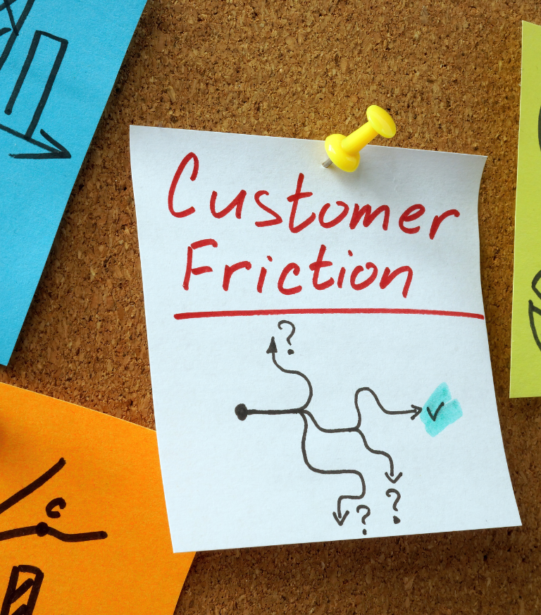
 popcreative
 All our design & development services
popcreative
3 mins
Carly is browsing for some outdoor furniture for her business. She runs a nursery and their old furniture is in need of replacing. She is looking for something with 0% finance in order to split out the payments to make them more manageable. This will be a key part in her decision making.
Carly lands on a site that sells a range of outdoor furniture. She sees from the top banner that they have a 0% finance option, so continues to browse through their collections. She is impressed by their stock and wants to purchase even more than she originally had planned because of their vast range of items.
However, once she looks further into their 0% finance option, she sees she is unable to find out through the site if she is able to benefit from it. To find out if she is eligible and what the monthly payments will be, she needs to get in touch with the company first via a telephone call. Due to the lack of information about how the 0% finance works, Carly grows frustrated and decides to look elsewhere.
Although she was impressed by the website and their goods, she did not feel comfortable discussing her finances on the phone and would have preferred if there was a form she could fill out on the site and apply through that.
Simply stating that you have the 0% finance option available is not enough for users, especially when they are looking to invest a large amount of money in you and your company.
User research helps us to find the general consensus toward a website and our ideas for improving them. By using a questionnaire, it would be easy to find out if users would find it beneficial/appealing to have an ‘apply for 0% finance’ button on the homepage, with a clear indication of how much could be paid monthly.
Alternatively, using a pop up banner to showcase the offer would show users as soon as they arrive on the site that there is an option, and is a way to give them any key details quickly. It would be easier to notice and understand, rather than a vague insinuation that they have the option. Clearly displaying the different options for pricing each month would also help users to know if the method is plausible for them and their finances, meaning the users won’t waste any time browsing through lots of pages that are of no use to them. This way, users are more likely to apply for the finance and use their services.
Learn how to grow your business with our expert advice.
popcreative  popcreative
  popcreative