 Social Media & Blogs
  PPC
PPC  Conversion Rate Optimisation
  UX Report
  Schedule A Call
  Get in touch
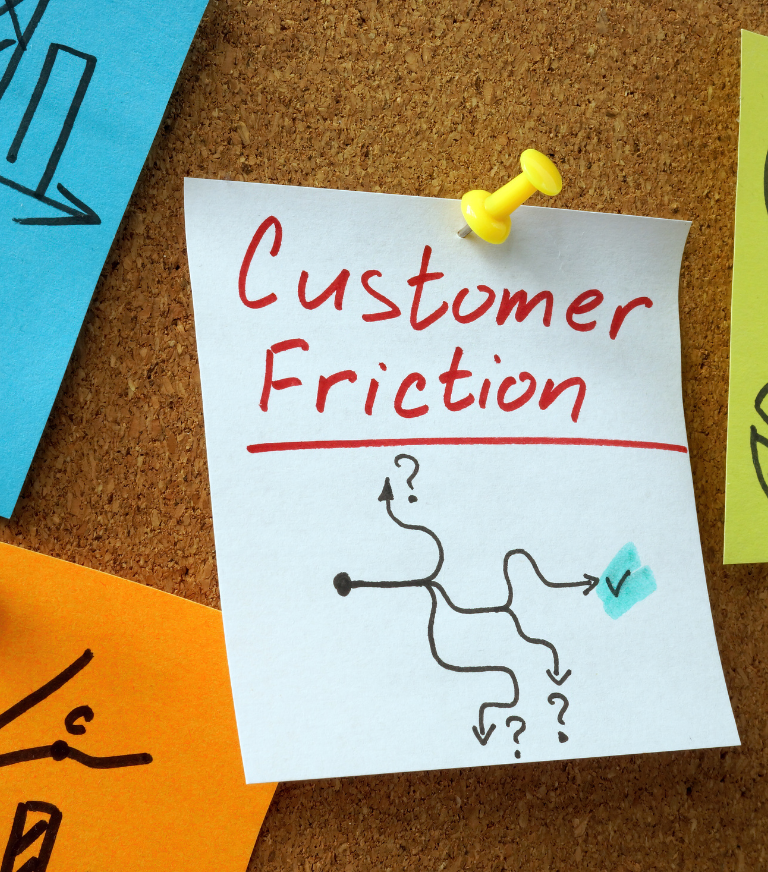
 popcreative
 All our design & development services
popcreative
6 mins
In today’s fast-paced digital age, a user’s attention span is limited and the competition for their attention is fierce. As a result, it’s more important than ever to optimise your website’s homepage for an excellent user experience. Users should be able to quickly and easily find what they’re looking for, understand your value proposition and trust your brand.
Your homepage is the first impression your website makes on users. A well-designed homepage can make a significant impact on user experience (UX) and lead to higher engagement and conversions.
In this blog post, we’ll be sharing best practices for optimising your homepage and creating an exceptional user experience in order to help increase your conversion rate.
Through our extensive user research (and a lot of testing), we’ve discovered some common issues that crop up time and time again. That’s why we’ve gone full-on superhero mode and put together some examples to tackle these issues head-on with some seriously effective solutions. We’re not just here to identify problems – we’re here to save the day with practical solutions to create a homepage that engages and converts users 🦸
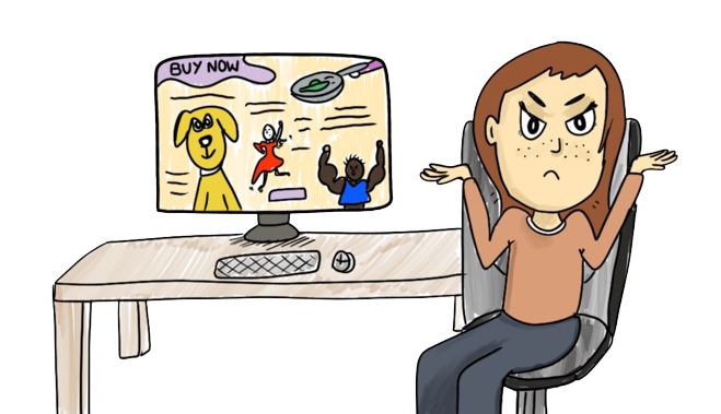
When users are bombarded with too much information on the homepage, they may become overwhelmed and leave the site.
To avoid overwhelming users, keep your homepage clean, simple, and focused on your core message. By using clear headings, subheadings and bullet points, you can break up your content into bite-sized pieces. Include only essential information, your value proposition, unique selling points and primary calls to action.
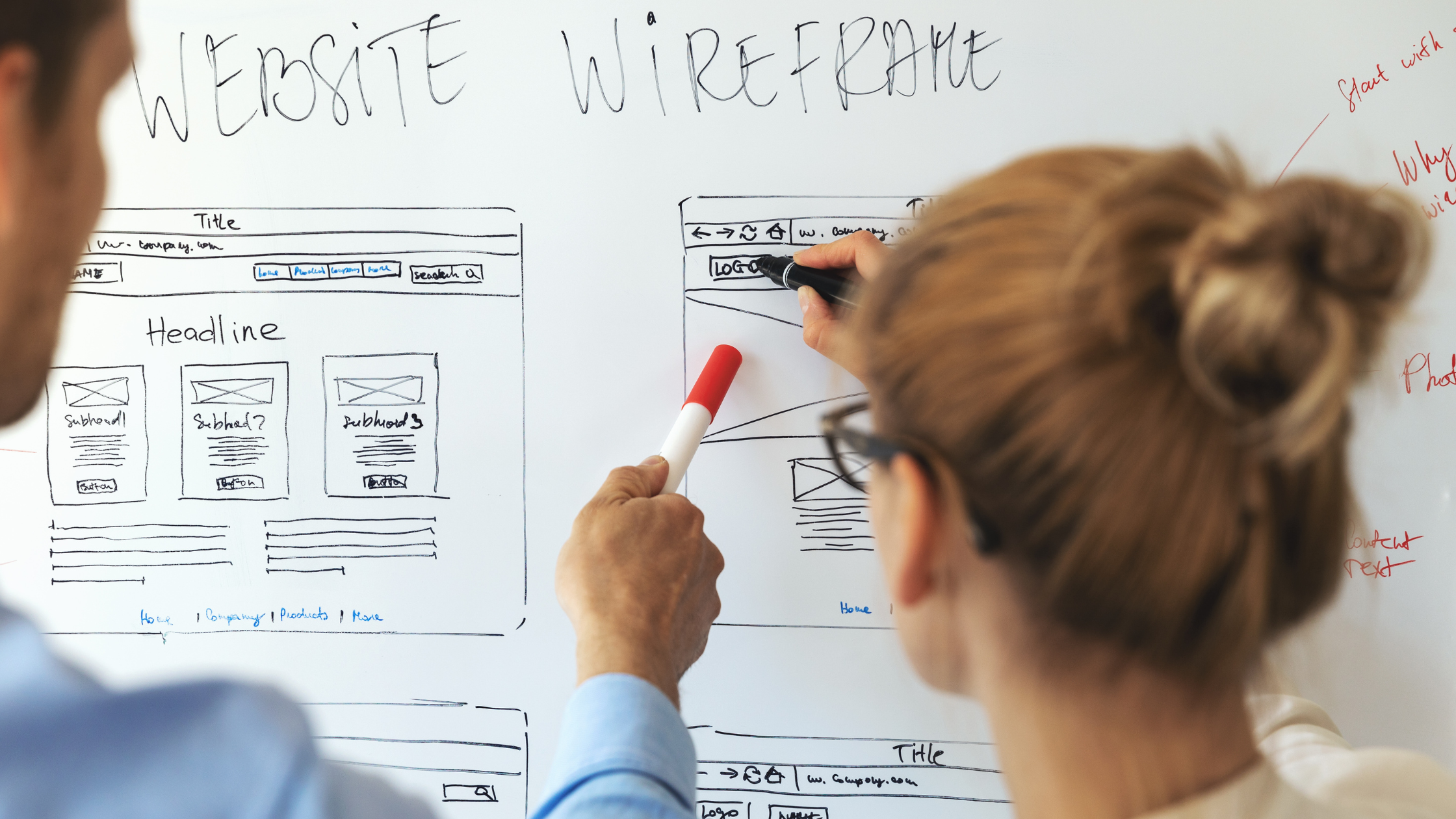
When users can’t easily find what they’re looking for on the homepage, they may get frustrated and leave the site.
Make it easy for users to find what they’re looking for by using clear navigation menus and search bars. Your navigation menu should be easy to find, easy to use and clearly labelled. Use descriptive labels that accurately represent the content on your site and place your search bar in a prominent location on the page.
If users don’t understand what you are trying to sell, they won’t stick around. If they came to your site looking for a specific thing and think you don’t provide it, you would have lost a potential customer.
A value proposition is a clear statement that describes the benefits and value your product or service provides to your customers. It is important on a homepage because it is the first thing users see when they land on your site, and it can make or break their decision to stay or leave.
Throughout your homepage you should highlight the benefits of your product or service. What makes you stand out against your competitors? How does your product or service fulfil the users’ needs?
If your business sells something with a lot of technical jargon associated with it- it’s best not to use too much of this. If you want to buy something for your friend’s bike for their birthday and you know nothing about bikes, but the website you’re on is full of terms like ‘foot plant’ and ‘crank flip’ – you may feel a bit alienated and annoyed. It’s best to keep it simple and explain any jargon used to avoid any potential confusion.
Your site should guide users to the next stage, with the final destination being to convert.
If you are not a well known brand, you need to put the work in to convince users of the worth of your services and the credibility of your brand.
If you don’t have reviews on your website, it’s kind of a red flag.
If other people have used your products or services and loved it – great! Showcase this to the world. If you have some stats to back up your points, that’s even better. Users are more likely to believe information that has exact figures included rather than vague messaging (like ‘we have lots of positive feedback’ – instead say ‘we have an average of 4.7* on Google’).
In conclusion, optimising your homepage for better user experience is essential for the success of your website. By following these best practices, you can create a homepage that engages users, communicates your message, and guides them towards desired actions. Remember to keep it simple, easy to navigate, and focused on your core message.
Get in touch today if you want your homepage utilised for UX.
Learn how to grow your business with our expert advice.
popcreative  popcreative
  popcreative